Turn colour confusion into a calm, personalized palette you can finally trust.
Choosing colours for your home shouldn’t feel like a risk.
A Colour Discovery Session helps you uncover the palette that feels right for you – emotionally and in your space – so you can stop guessing and start choosing with confidence.
Colour as Emotional Design
Colour influences mood, perception, and how we experience space over time. When it’s chosen with awareness, it reduces friction. It supports calm, focus, and emotional safety.
This consultation helps you move from hesitation to confidence, and from visual decisions to meaningful ones.
This Is Not About Picking Paint Colours
Most colour consultations focus on answering questions like:
-
Which white is best?
-
Should this wall be warmer or cooler?
-
What colour is trending right now?
That’s not what happens here.
Instead, we explore:
-
Which colours you’re naturally drawn to and which ones you avoid
-
How colour shows up in your memories and daily life
-
What emotions you want your home to support
-
Why certain spaces feel heavy, flat, or disconnected
Sometimes people want to add colour to their home but are afraid they’ll get tired of it. That fear usually comes from choosing colour without meaning. When colour is chosen only visually, it often feels wrong over time.
When colour is connected to emotion, it lasts.


The False Perception of Calm
Many people assume quiet, neutral rooms are automatically calming.
White walls, minimal contrast, very little visual input – it looks peaceful, so it must feel peaceful.
But quiet is not the same as calm.
Calm is an emotional state, not a paint colour. It comes from feeling supported, grounded, and safe. When a space is visually empty but emotionally disconnected, it doesn’t create calm – it creates distance. Plain white or overly neutral rooms can start to feel sterile, unfinished, or subtly uneasy over time.
When colour is removed instead of intentionally chosen, the result isn’t calm. It’s a muted environment that doesn’t actively support how you feel in your home.
What If Your Home Could Support
Positive Emotions?

This consultation is about reconnecting you with the colours that already feel positive, comforting, and energizing to you
How the Consultation Works
This consultation is designed to help you reconnect with the colours that support positive emotions for you, not to select paint colours off a fan deck.
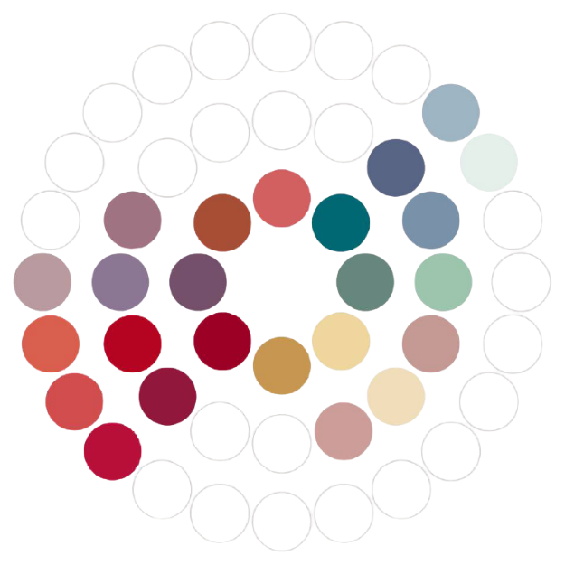
Part 1. Reconnecting with Emotional Responses to Colour
We start by exploring how you emotionally respond to different colours through a guided review of curated colour boards. This part is reflective and intuitive. The goal is to identify which colours evoke a sense of comfort, calm, energy, or well-being for you, based on your personal experiences rather than trends or rules.
Part 2. Colour Direction and Application
Using the insights from this exploration, I analyze the patterns that emerge and define a colour direction that feels emotionally aligned with you. This becomes the foundation for how colour can be introduced into your home. Sometimes subtly, sometimes more boldly, always intentionally.
The outcome is not a single paint colour, but a clear understanding of which colours support how you want to feel in your space, and how they can be used without fear of getting tired of them.