
Are White Walls a Good Idea? Why Your "Clean" Room Might Be Making You More Anxious
- Mar 13
- 7 min read
Updated: May 4
White walls are supposed to feel calm. Clean. Like a fresh start. So you painted everything white, or close to it, and waited to feel better. But the room still feels cold. Or flat. Or like something is just slightly off, and you can't name what.
If you've ever wondered, "Are white walls a good idea?" for your home, you're not alone. The answer is more complicated than any paint brand will tell you. Here's what nobody told you: for many nervous systems, an all-white room isn't restful. It's depleting. And the science behind why is worth understanding before you reach for another can of Chantilly Lace.
The Hidden Problem: Too Little For Your Brain To Work With
We're often told that white equals calm, clarity, and a fresh start. But from a psychological perspective, extremely neutral interiors don't offer enough variety or depth for our senses to comfortably read the space.
Instead of gently soothing the mind, that lack of visual cues can push your attention inward. For many people, that amplifies anxiety, rumination, and irritability. What we know about monotonous environments suggests that too little stimulation can reduce motivation and make it harder to focus, especially if you're already feeling overwhelmed or emotionally flooded.
This is one reason people often gravitate toward all-white spaces during burnout or emotional overload: the emptiness feels like control. But if the environment stays too blank for too long, the tension you were trying to escape has nowhere to go. It just echoes back at you inside the white box.
The Biological Toll: Your Eyes Are Working Overtime

The all-white room doesn't just affect your mood; it changes how hard your body has to work just to exist in the space.
In nature, most vertical surfaces—trees, foliage, rock, and earth—reflect roughly 40–60% of the light that hits them. Our visual system evolved in response to this mid-range reflectance, where there's enough contrast to see clearly but not so much that everything glares.
Many bright white paints, by contrast, reflect 80–90% of the light that hits them, especially in smooth modern finishes under strong daylight or overhead lighting. In a room like that, the tiny muscles in your eyes are working constantly, adjusting to glare and contrast like a camera lens that can't quite find focus.
Over time, that continuous micro-effort contributes to visual fatigue, tension headaches, and a low-grade sense of unease, particularly if you already spend your day staring at backlit screens. The room that looks minimalist and relaxing in a photo may, in reality, be asking your body to work overtime just to process what it's seeing.
The White Cube Problem: You're Not an Exhibit

Our cultural obsession with ultra-white interiors didn't come from nowhere. It echoes the "white cube" gallery model that emerged in the 20th century, with unadorned white walls, even lighting, and minimal distraction, so the artwork becomes the only focus.
That works beautifully for a temporary exhibition. You visit for an hour or two, engage with the art, and leave. But a home is not a gallery, and you are not meant to live your daily life as if you're on display.
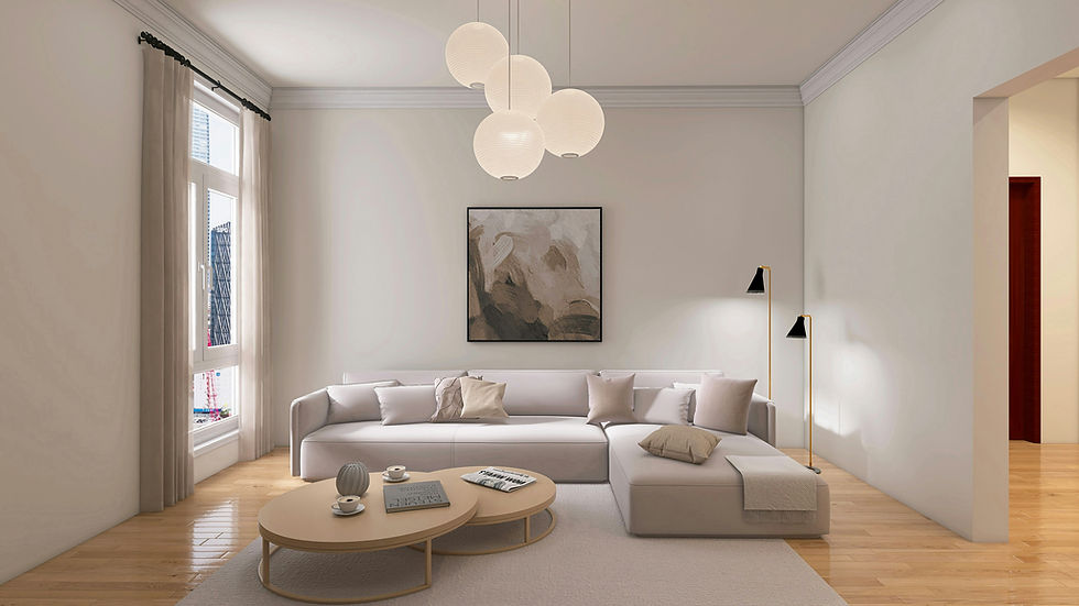
You cook, rest, argue, cry, decompress, and heal in these rooms. They need to support your nervous system, not just your Instagram grid. There's nothing inherently wrong with white walls when they're chosen intentionally, as part of a balanced palette. The problem arises when we default to white out of fear, overwhelm, or pressure to match what we see online, and then wonder why the space still doesn't feel like home.
Designing Your Way Out of the Neutral Trap
Are White Walls a Good Idea? It Depends on This
If you're reading this from a very white room and feeling called out, take a breath. You don't need to repaint your entire home tomorrow. But there are a few powerful shifts that can give your brain and body real relief.
Neutrals Can Still Be Right For You
Before you panic-paint everything teal... It is completely okay if your genuine preference is neutral. I recently worked with a client who, after her color test, turned out to be deeply drawn to soft neutrals: warm beiges, gentle greys, muted whites. That's how her nervous system feels safest, and honoring that matters.
Where things had gone wrong wasn't her love of neutrals. It was the advice she'd absorbed. She'd read that the "safest" approach was to pick one neutral and use it everywhere—the same color on walls, cabinets, trim, even the ceiling—so she "wouldn't make a mistake." When she described it, she looked exhausted.
I told her, gently, that this was actually the biggest mistake. Not because neutrals are bad, but because turning an entire home into one flat, repeating tone strips the space of depth, orientation, and comfort. Her caution had pushed her into a kind of visual shutdown: if everything was the same color, she couldn't get it wrong, but she also couldn't feel at home.

What we did instead was keep her neutral palette but diversify it: slightly deeper, warmer tones on the lower cabinets, a softer mid-tone on the walls, a lighter shade on the ceiling, and texture everywhere—fabrics, wood, and stone. Suddenly, she could feel where the room began and ended. Her eyes had places to rest and places to land. The space still felt calm and neutral—but now it was supporting her, not draining her.

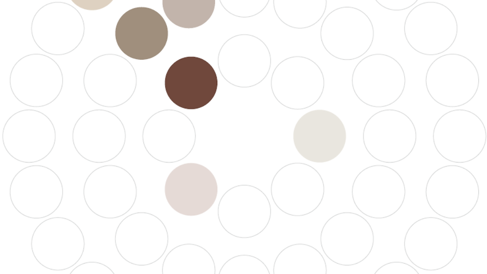
"This client's nervous system genuinely needed neutral. Every tone here came from her color test. The warmth, the layering, the contrast between surfaces, that's what turned a draining white room into a space she actually wants to come home to."
The LRV Rule: A Number Worth Knowing
Here's a practical tool most people have never heard of: LRV, or light reflectance value. It's a number printed on most paint chips that tells you exactly how much light a color bounces back, on a scale from 0 (pure black) to 100 (pure white).
Most bright whites sit at LRV 85 or above. That's the glare zone, the range where your eyes start working harder than they should in a space you're meant to relax in.
A useful target for living spaces is LRV 40–60, which mirrors the natural reflectance of the outdoor surfaces our visual system evolved alongside. Colors in this range still feel light and open, but they give your eyes something to actually land on.
A good real-world example is Benjamin Moore Pale Oak. It sits at around LRV 68—high enough to read as a warm, almost-white neutral in most lights, but complex enough that it doesn't glare. In photos, it looks white. In person, it feels warmer. That gap is exactly what makes it work so well in real homes—it photographs like the neutral epidemic but lives like something softer.

Soft complex neutrals, muted greens, blues, and clay tones often live in that 40–70 LRV range. They tend to feel calmer over time than a high-glare white—not because they're more colorful, but because they're easier on the biology that has to live inside them every day.
Design for Your Biology, Not the Algorithm
Color is part of how your brain reads safety, depth, and time of day. And there is no single perfect palette for everyone.
A more useful question than "is this room neutral or colorful?" is simply: how does this room make my body feel after a full day? Do my eyes feel relaxed or strained? Do I feel grounded, or vaguely restless and flat?
If the answer is strained, restless, or blank, your palette may be further into the high-glare, low-information end of the spectrum than your nervous system can comfortably handle, even if it isn't technically all white.
Use the Colors of Your Happy Memories
Instead of copying a celebrity's beige living room, look inward. Think back to specific moments in your life when you felt deeply safe, joyful, or cared for—a childhood bedroom, a grandparent's kitchen, a forest trail, a beach at dusk.
What colors were actually there? Not the colors you think should have been there, or the ones that looked beautiful in a photo, but the ones your body remembers. The soft green of a mossy path after rain. The warm yellow of a lampshade that made everything feel safe. The smoky blue of evening light coming through a window you loved. The terracotta tile in a family kitchen where someone always seemed to be cooking.
Those colors are data. They're not random preferences; they're your nervous system's record of what safety, comfort, and belonging have looked and felt like in your actual life. When you bring even one of them into your home, on a wall, in a textile, in a piece of art, you're not decorating. You're giving your nervous system a reference point it already trusts.
That's the difference between a room that looks calm and a room that feels calm. One is styled. The other is designed for you.

"This is what it looks like when you stop copying someone else's neutral and start designing from your own story. Every color in this room came from one client's happiest memories. None of it is white. All of it is calm."
What Your White Room Is Actually Telling You
If you're sitting in a white room that looks right but feels wrong, you're not imagining it—and you're not broken. Your nervous system is just waiting for something that actually belongs to you.
In a Color Discovery Session, we use your personal color history, the specific shades connected to your happiest, safest memories, to build a palette that supports how you actually feel, not just how your home looks on camera.
This isn't a generic color consultation. There's no color wheel, no trend board, no "what's popular right now." It's a 30-minute conversation that gives you clarity about the colors your nervous system has been asking for, possibly for years.


Comments