
How Minimalist Interiors Failed Us (And Why You Don't Have to Live in a White Box)
- Apr 23
- 6 min read

There's a reason so many of us are drawn to the idea of minimalism. It rarely starts with aesthetics.
It starts with a feeling. The low-grade exhaustion of a home that never quite feels manageable. Surfaces that accumulate things without your permission. The Sunday afternoon you spend reorganizing a drawer that will be chaotic again by Wednesday. At some point, most of us hit a wall and think: I just want less. I want to walk into a room and feel like I can breathe.
That impulse is real and it's worth listening to.
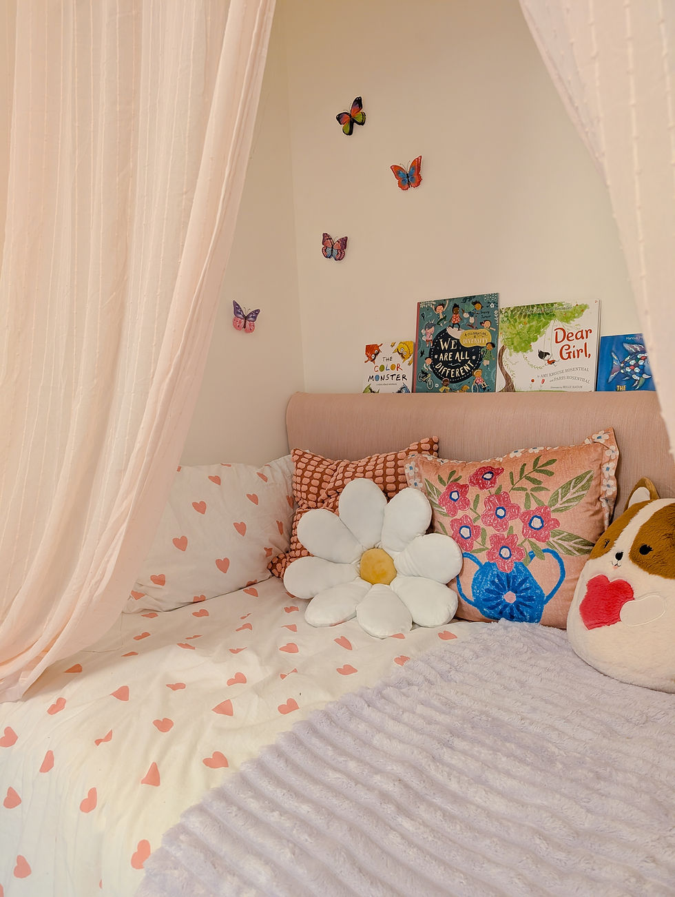
So you go looking for ideas. You open Pinterest, or Instagram, or a design blog. And what you find is this: white walls. Pale concrete floors. A single beige sofa. One ceramic vase. A dried olive branch. The same image, over and over, with slightly different furniture.
It looks chic. It looks "clean." This is what minimalist interiors actually look like when the design industry gets hold of the idea.
It also looks like a high-end dental clinic.
This is the bait-and-switch the design industry pulled on us. We came looking for relief from overwhelm, and we were handed an aesthetic. Owning less stuff is genuinely good for your nervous system. But somewhere along the way, the industry translated "less clutter" into "less color" and "fewer things" into "fewer inputs." Those are not the same idea.
You can absolutely own less and still live in a home that feels alive.
How Minimalist Interiors Lost Their Color (And It's Not About Taste)
Before we talk about color, we need to talk about why it disappeared in the first place. Because this isn't actually a story about minimalism. It's a story about real estate economics.

After the 2008 housing crash, homebuilders were under enormous pressure to move inventory. The solution: design for nobody in particular, so nobody could object. Strip out anything bold, anything specific, anything that might alienate a buyer. Beige walls. Greige cabinets. White trim. The same finishes in every development, in every city, all optimized for resale rather than for the person who would actually live there.
It worked. Neutral interiors sell faster, and agents still recommend them today. But the side effect is that an entire generation internalized builder-grade neutrality as the visual language of "clean" and "sophisticated."
That's the bias you're carrying when you stand in the paint aisle and put back the rich blue you love in favor of something called "Accessible Beige." It's not a design opinion. It's a market correction masquerading as one.
The Difference Between Clutter and Sensory Starvation
The functional side of minimalism is real and worth keeping. Visual clutter competes for your attention and increases cognitive load. Owning fewer things means fewer decisions, less friction, less noise. That part is right.
The problem is what happens when "less stuff" becomes "less everything."
Human beings aren't designed to live in sensory vacuums. A 2016 study at Maastricht University found that people in monotonous, boring situations voluntarily administered mild electric shocks to themselves — apparently preferring a jolt of stimulation to the tedium of nothing. The study was about boredom specifically, not bare rooms, but the principle holds: our nervous systems actively seek input. When a room offers no color, no contrast, no visual rhythm, nothing for your eye to land on, your brain doesn't relax. It searches. That restless, vaguely unsettled feeling in a stark white room isn't your imagination. It's your nervous system still looking for something to engage with.
As the Bauhaus color theorist Johannes Itten put it: "Color is life; for a world without color appears to us as dead."
That's not poetic. That's biology.
Why Color Makes Us Feel the Way It Does
To understand why color matters so much, you need to know what your brain is actually doing with it.
Color vision in primates evolved partly to detect ripe fruit and young leaves against green foliage, which is to say, color was one of the earliest signals our ancestors used to find nourishment. Over an enormous span of time, vivid color reliably meant something good. Something sustaining. The brain started rewarding that detection, and traces of that wiring are still running.

But the deeper mechanism is memory. Color is one of the sensory details your brain encodes when it stores an emotional experience. It gets filed alongside the feeling. And later, when you encounter that color again, even without any other context, even without realizing what's happening, the emotion comes with it. The warm orange of your grandmother's kitchen. The particular green of a garden where something good happened. The yellow of a childhood room where you felt safe.
Research shows this pathway runs through the amygdala, which processes emotion, and operates below the level of conscious awareness. You don't decide to feel something when you see a color. You just do. Color-emotion associations are partly biological (warm colors increase arousal and attention; cool colors lower it), and partly autobiographical, built from the specific palette of your own life.
This is why a room painted in a color that resonates with you can feel immediately, inexplicably right. It's not decorating. It's recognition.
And it's why a room stripped of all color can feel, despite being perfectly tidy, like something essential is missing.
Weeding vs. Planting

I find it useful to think about decluttering the way you'd think about weeding a garden. Removing the things that don't serve you is necessary work. It clears the noise. It gives you a clean canvas to work with.
But weeding alone doesn't make a garden. You still have to plant something.
Minimalism taught us to pull the weeds. Then it made us feel guilty for wanting to plant anything vibrant in their place. We became afraid that choosing a bold color or a rich pattern would mark us as unsophisticated, or chaotic, or "too much." So we made safe choices. Neutral choices. And we ended up with homes that were tidy but impersonal, spaces that looked fine in photos and felt like nothing in real life.
What Colorful Minimalism Actually Looks Like
You don't have to choose between chaos and sterility. Here's how to hold both things.
Keep the count low, turn the richness up. You can own three plates, one great frying pan, and zero junk drawers, and still paint your kitchen cabinets a deep, saturated green. You don't need twenty throw pillows to make a sofa feel inviting. You need one or two in a richly textured, beautifully colored fabric. Keep things minimal. Let the color and quality of what remains do the heavy lifting.
Layer your neutrals with life. If a neutral foundation genuinely settles your nervous system, that's real and worth honoring. But give your brain the complexity it needs within that neutrality. A piece of vivid art. A vintage rug with depth and pattern. A bowl of bright fruit on the counter. Your eyes need somewhere to land.
Stop designing for a hypothetical buyer. When you paint your walls "greige" for a future sale, you are actively choosing not to design the space for the person living in it today. That person is you. You're the one waking up in it. Design for your nervous system, not an imaginary one.
Let one thing break the rules. A room needs a little tension to feel alive. A bold lamp. An unexpected color on a single wall. A piece of art that surprises you. The room doesn't need to match. It needs to cohere.
The Only Question That Matters
We chase neutral palettes because we never stopped to ask the most important question: what do I actually need here to feel at home?
Your home is not a container for your stuff. It's an environment that's in constant conversation with your nervous system. When you fill it with colors that carry meaning for you, color your brain recognizes from something good, you're not making a decorating choice. You're giving your biology what it's been looking for.
Clear the clutter. Then please, plant the flowers.
Your home. Your rules.

If you're ready to stop guessing and find out which colors actually belong in your home, the Colour Discovery Session at Feels Like Home is where that work happens. It's a 30-minute guided session that explores how you emotionally respond to color, not which trends are current, not which white is "right," but which palette your nervous system already recognizes as yours.
You walk away with a written color direction report and, more usefully, the confidence to make choices you won't second-guess. Because when color is connected to meaning rather than chosen visually, it doesn't just look good. It lasts.


Comments